Introduction
When we use:
lm(your_model_name)
summary(your_model_name)
It will return you plots like this:
These plots are:
- Residuals v.s. fitted values plot
- Normal Q-Q plot
- Square root of standardized residuals v.s. fitted values plot
- standardized residuals v.s. leverage plot
It’s important for us to understand how well our model fit and how to improve our model.
Residuals v.s. fitted values plot
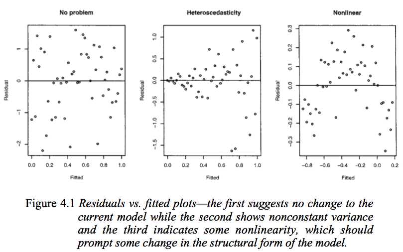
Above is a figure from Faraway’s Linear Models with R (2005, p. 59).
Picture in the left: dots are randomly distributed, which indicates the residuals and the fitted values are uncorrelated.
Picture in the middle and right: dots have some kind of patterns, which seem to indicate dependency between the residuals and the fitted values, suggest a different model.
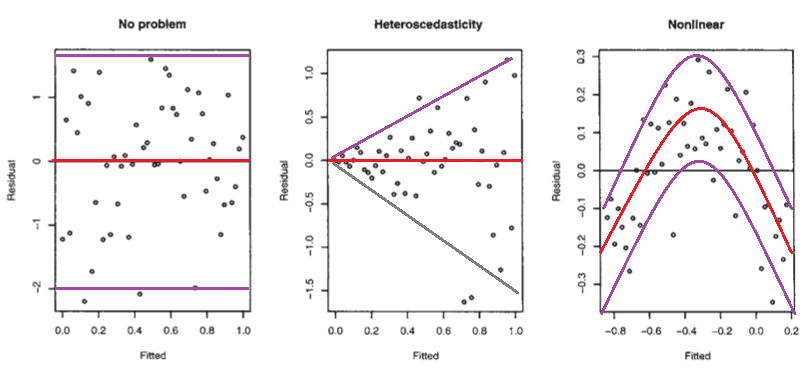
Above are those residual plots with the approximate mean and spread of points (limits that include most of the values) at each value of fitted (and hence of $x$) marked in - to a rough approximation indicating the conditional mean (red) and conditional mean ± (roughly!) twice the conditional standard deviation (purple).
- The second plot shows the mean residual doesn’t change with the fitted values (and so is doesn’t change with $x$), but the spread of the residuals (and hence of the 𝑦y’s about the fitted line) is increasing as the fitted values (or $x$) changes. That is, the spread is not constant. Heteroskedasticity .
- The third plot shows that the residuals are mostly negative when the fitted value is small, positive when the fitted value is in the middle and negative when the fitted value is large. That is, the spread is approximately constant, but the conditional mean is not - the fitted line doesn’t describe how 𝑦y behaves as $x$ changes, since the relationship is curved.
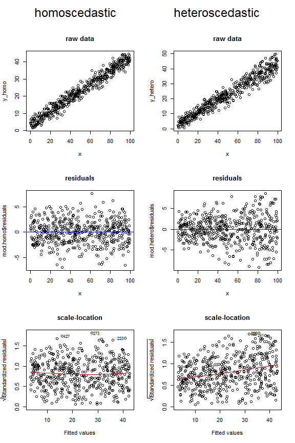
Difference between homoscedastic and heteroscedastic
Q-Q Plot and P-P plot
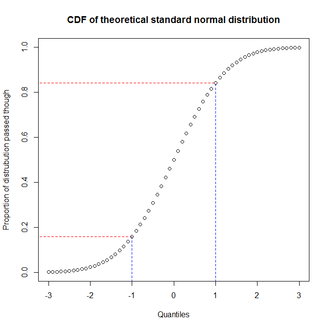
We see that approximately 68% of the y-axis (region between red lines) corresponds to 1/3 of the x-axis (region between blue lines). That means that when we use the proportion of the distribution we have passed through to evaluate the match between two distributions (i.e., we use a pp-plot), we will get a lot of resolution in the center of the distributions, but less at the tails. On the other hand, when we use the quantiles to evaluate the match between two distributions (i.e., we use a qq-plot), we will get very good resolution at the tails, but less in the center. (Because data analysts are typically more concerned about the tails of a distribution, which will have more effect on inference for example, qq-plots are much more common than pp-plots.)
Hence, in statistics analysis, we use Q-Q plot more often because we want to focus on the tails of a distribution.
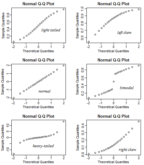
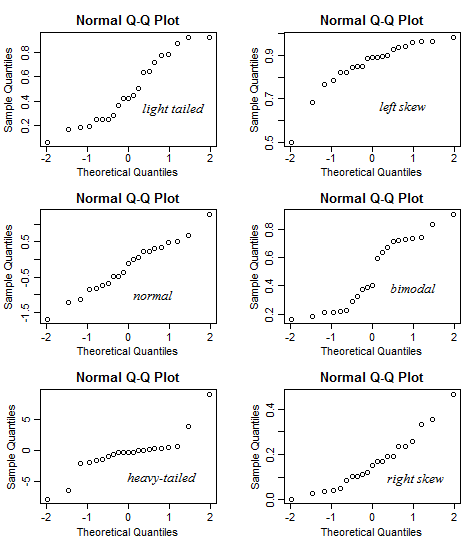
How to read Q-Q plot
- Here’s what QQ-plots look like (for particular choices of distribution) on average:
- But randomness tends to obscure things, especially with small samples:
Scale-Location Plot
When looking at this plot, we check for two things:
1. Verify that the red line is roughly horizontal across the plot. If it is, then the assumption of homoscedasticity is likely satisfied for a given regression model. That is, the spread of the residuals is roughly equal at all fitted values.
2. Verify that there is no clear pattern among the residuals. In other words, the residuals should be randomly scattered around the red line with roughly equal variability at all fitted values.
Here is an example to test your model’s homoscedasticity.
Residuals vs. Leverage Plot
Leverage refers to the extent to which the coefficients in the regression model would change if a particular observation was removed from the dataset.
Observations with high leverage have a strong influence on the coefficients in the regression model. If we remove these observations, the coefficients of the model would change noticeably.
Standardized residuals refer to the standardized difference between a predicted value for an observation and the actual value of the observation.
If any point in this plot falls outside of Cook’s distance (the red dashed lines) then it is considered to be an influential observation.