What is Data Visualization?
So, you probably think data visualization is just some bars and lines, since everyone seems to know how to draw and use matplotlib library in Python.
Is these data visualization? Yes, but there could be more.
The greatest value of a picture is when it forces us to notice what we never expected to see.
— John Tukey
Let’s see some famous statistical graphics in our history.
Fig.1 Exports and Imports to and from DENMARK & NORWAY from 1700 to 1780
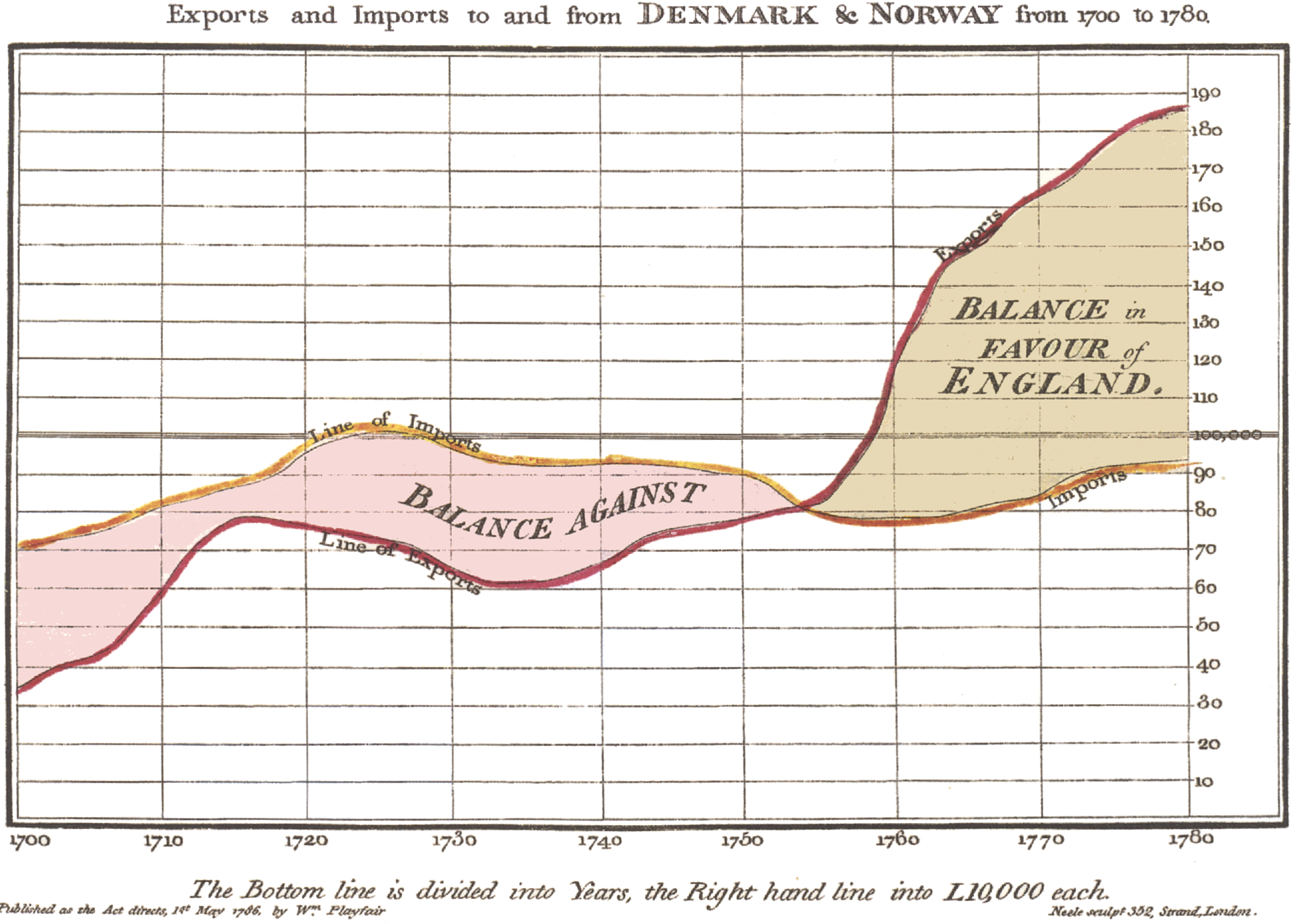
This figure credits to WIKIPEIDA-William Playfair, in this figure it clearly shows the imports and exports data from 1700 to 1780 of England, at a glance we can know which year has a trade surplus and which has a trade deficit. By the way, William Playfair is also the father of pie chart.
Fig.2 How John Snow traced the source of a cholera outbreak in Soho, London in 1854
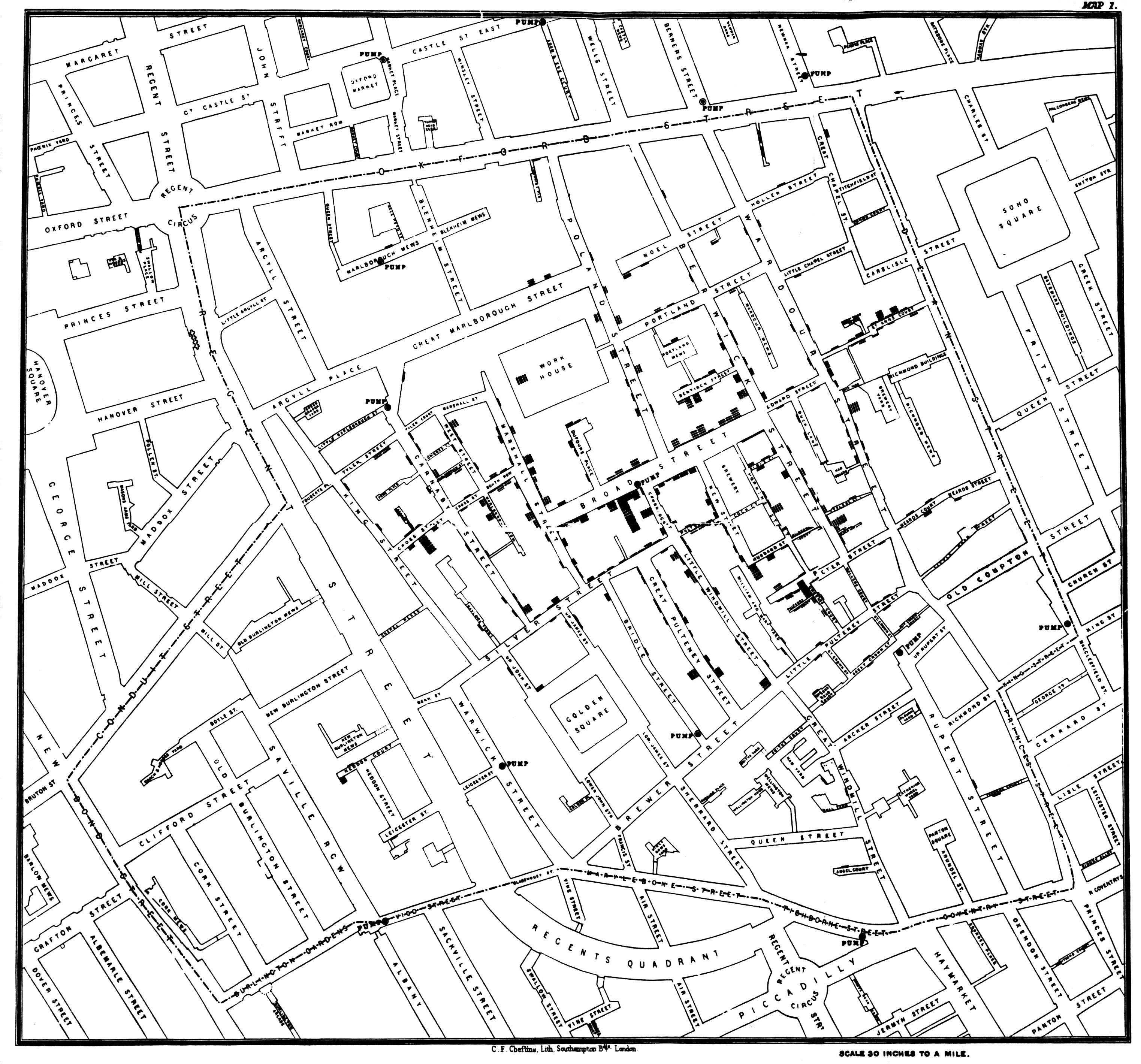
In 19th Century of London, the city was a nightmare to human due to lack of clean water and sewage system, trash piled up everywhere in the city. On the other hand, it was heaven for epidemic. In Soho, London, 1854, there was an outbreak of cholera. At that time the germ theory of disease had not yet been developed. Most people thought cholera was caused by the foul air. Doctor John Snow was quite skeptical about the “pollution air theory”, he decided to conduct his own investigation. By talking to local residents, he identified the true reason was in the public water pump even though his chemical and microscope examination of a water sample from the water pump did not conclusively prove its danger. The reason behind this is because the obvious geographical pattern in his figure.
Fig.3 Figure of the causes of mortality in the army in the East by Florence Nightingale.
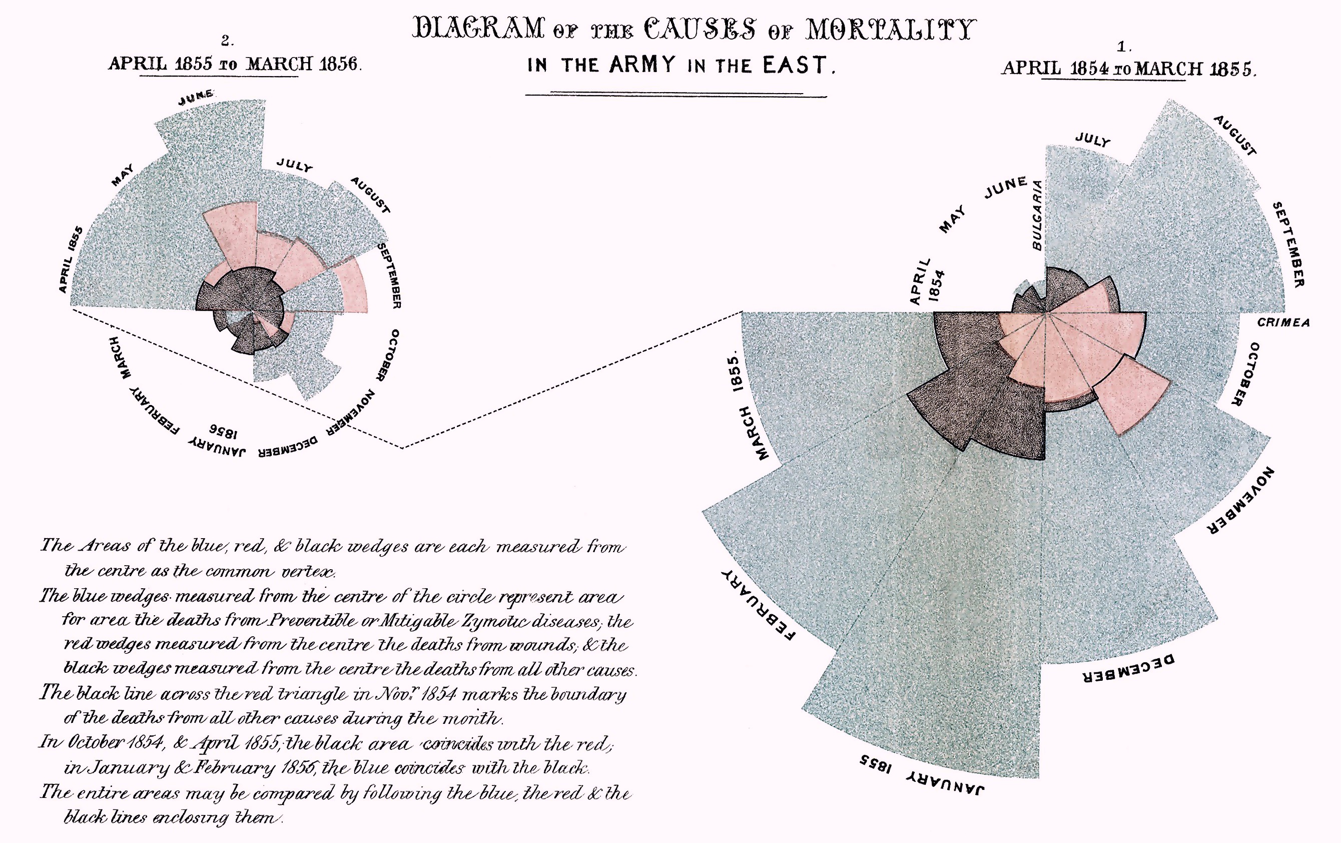
Florence Nightingale was an English social reformer, statistician and the founder of modern nursing. Nightingale is described as “a true pioneer in the graphical representation of statistics”, and is credited with developing a form of the pie chart now known as the polar area diagram (rose diagram) shown in fig.3.
In fig.3, blue color measures deaths from predictable diseases, red color measures deaths from wounds, and black color measures deaths from all other reasons. She successfully persuaded the Government of the United Kingdom to improve medical care and health service for the army, after 10 years of sanitary reform, mortality among the soldiers in India had declined from 69 to 18 per 1,000.
Nowadays, data visualization can be more.
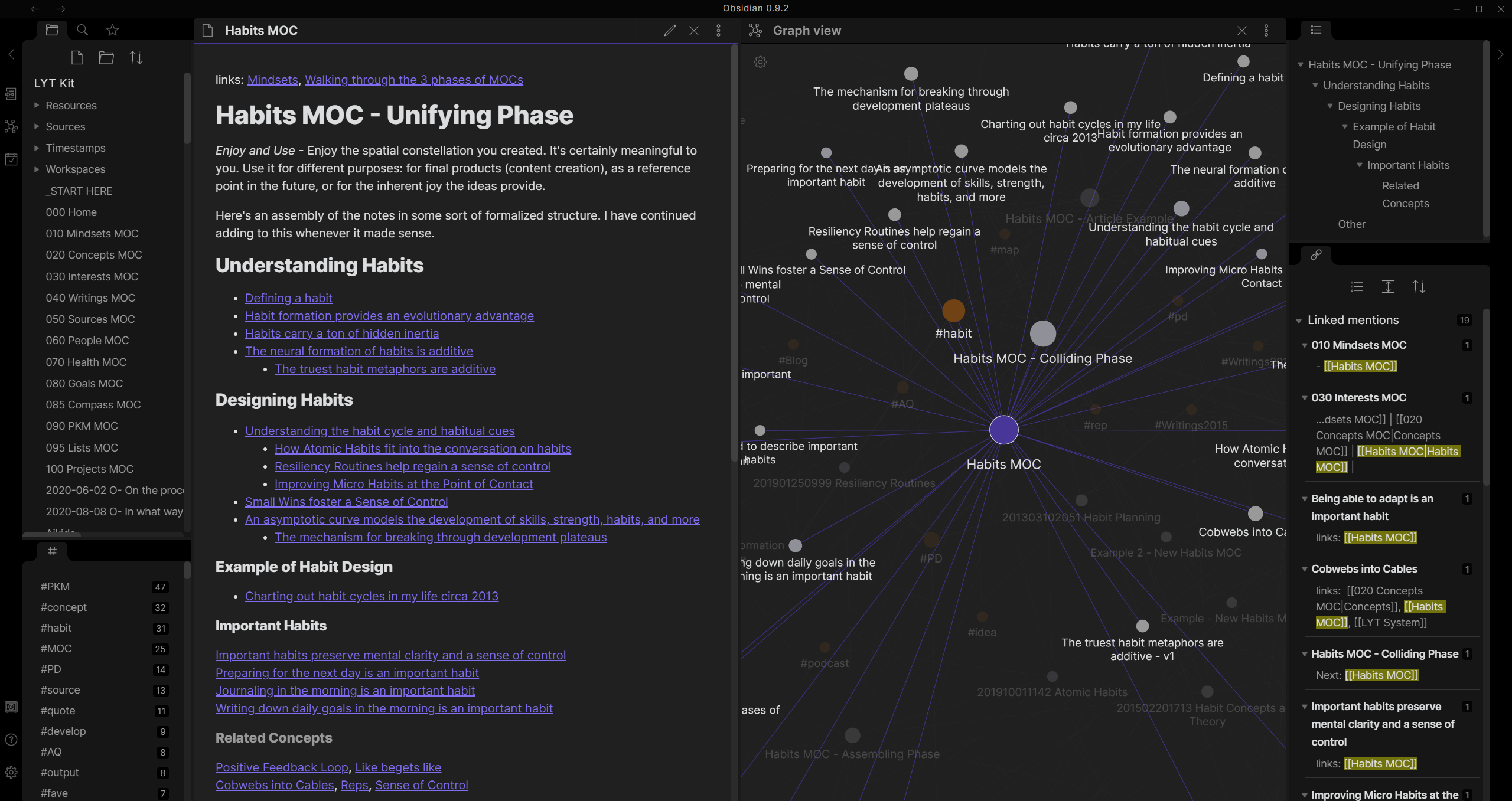
Credit to Obsidian
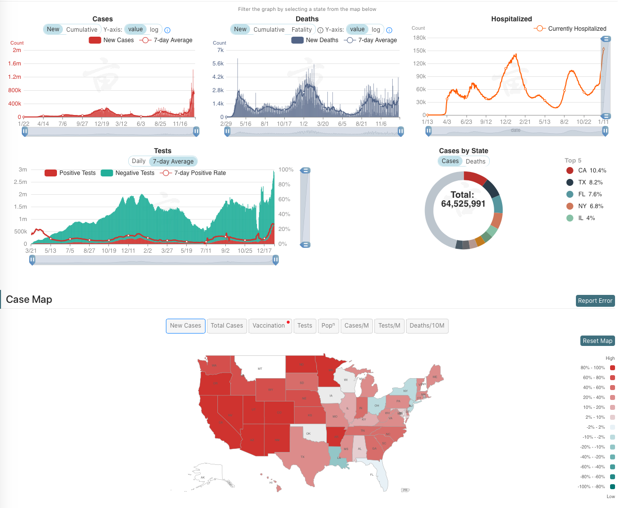
Credit to 1point3acres
Data Visualization is the creation and study of the visual representation of data.
— WIKIPEDIA
Three Types of Data Visualization
- Information visualization
- Scientific visualization
- Visual analytics
Information visualization
Information visualization is the study of visual representations of abstract data to reinforce human cognition.
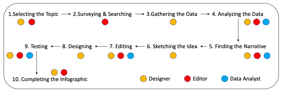
Above figure shows how people in a team (designer, editor and data analyst) make an infographic.
Credit to Wikiwand
Scientific visualization
Scientific visualization is an interdisciplinary branch of science concerned with the visualization of scientific phenomena. It is also considered a subset of computer graphics, a branch of computer science. The purpose of scientific visualization is to graphically illustrate scientific data to enable scientists to understand, illustrate, and glean insight from their data.

Credit to Wikiwand
Visual Analytics
Visual analytics is an outgrowth of the fields of information visualization and scientific visualization that focuses on analytical reasoning facilitated by interactive visual interfaces.
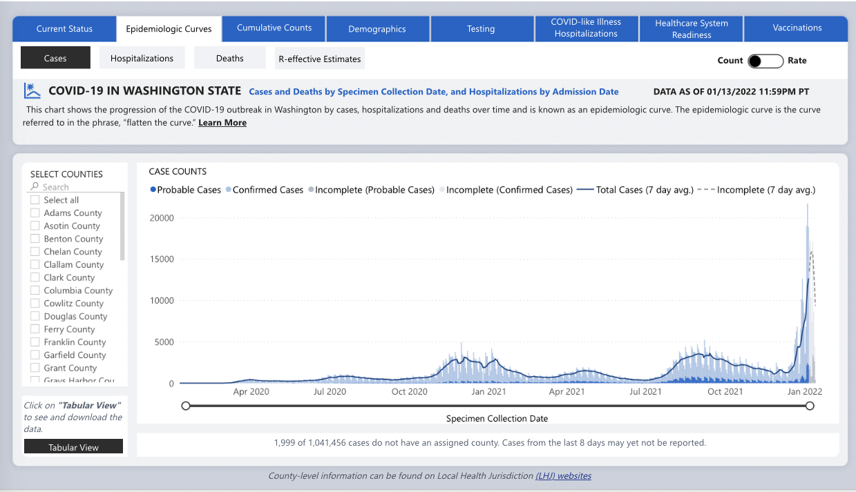
Credit to Washington State Department of Health
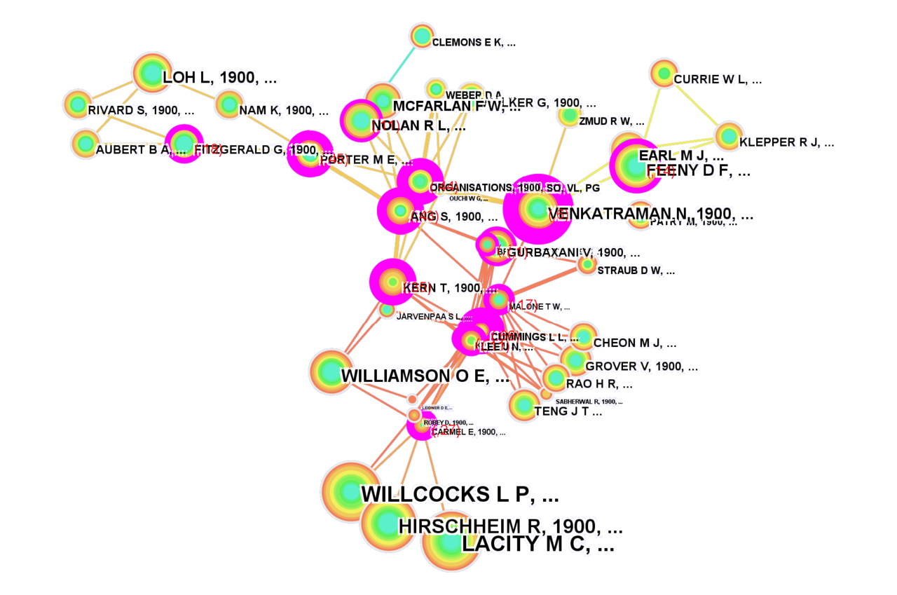
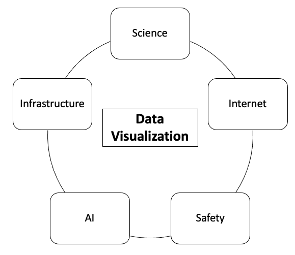
Hot Topics And Trends of Data Visualization
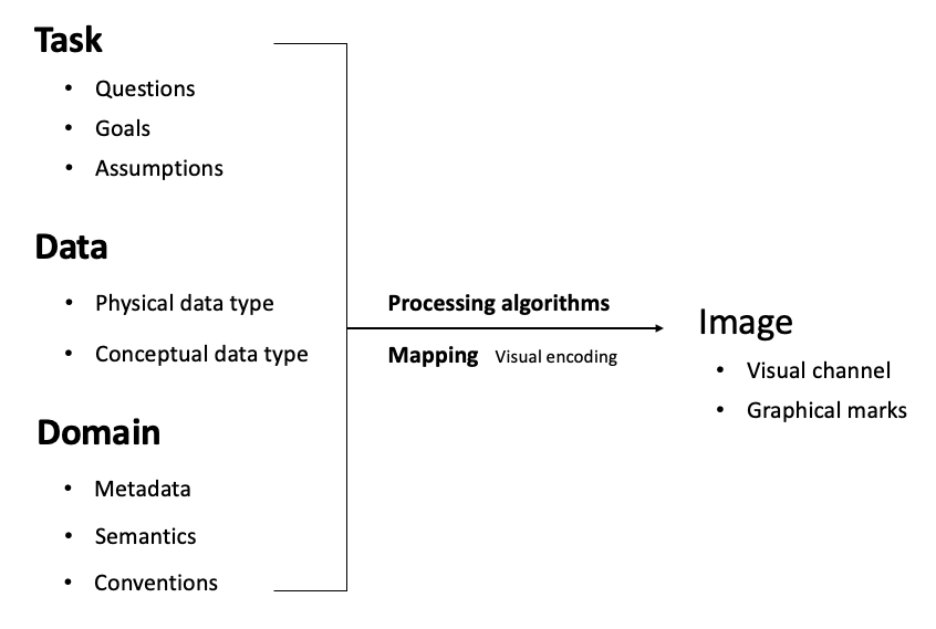
Foundations of Data Visualization
There are three basic elements of data visualization.
- Process of data visualization
- Data model
- Visual coding
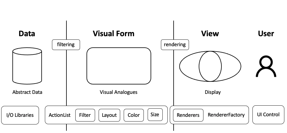
Process of Data Visualization
Data Model
-
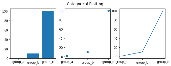
Categorical data
- Gender: male, female in general
- Size of clothes: small, medium, large
-
Ordinal data (is kind of categorical data, but it is ordinal)
- First prize, second prize, and third prize
- Elementary school, middle school, high school
-
Numerical data
- With specific number to describe
Categorical data and ordinal data can be attributed to qualitative data, numerical data can be attributed to quantitative data.
Visual coding